The French company Gilson is specialized in the creation and installation of pasteurizers and acetators. It is a family business whose history dates back to 1959 and which has gradually developed and maintained its originality in an increasingly competitive market.
In 2021, the company was taken over and it was decided to modernize the communication and image of the company. Gilson therefore approached me to review its identity, redesign its logo and create a custom website.
The many interviews with the client revealed an attachment to the family and human side of the company, but also a strong desire to be able to confront their international competitors with a much more "industrial" image.
It was quickly concluded that this industrial side was going to take over a little bit while remaining close to nature, the human and the history of the company.
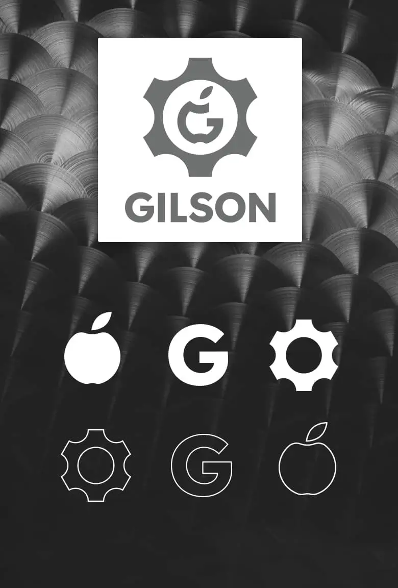
The "apple" was directly identified as an important element to use in the logo and the company’s identity. The very first directions were in this direction. Here are the very first sketches (only thought directions):
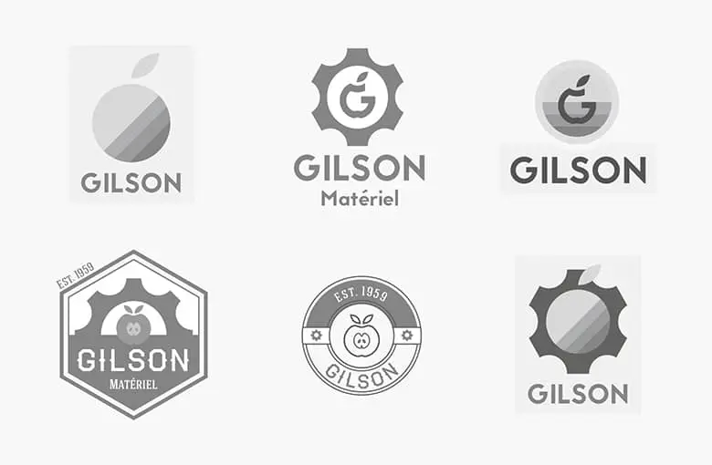
The wheel with the stylized apple was directly chosen without any real doubt... and only required some refinements in shapes, proportions, spaces, curves.
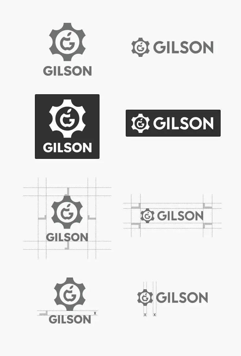
The typography required a particular care and several proposals have been provided to the client. Once the choice has been made, a new session of adjustments on the icon and the typography (kerning, spaces) was done.
Finally, several color palette proposals were submitted to the client: gray (neutral-industrial), green (apple-nature), red (apple-passion) and blue (scientific-previous client request).
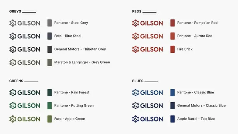
To my surprise, the most neutral gray was chosen. Although practical and bringing out the industrial side of the company, the family, human and nature side will have to be brought out in another way (which I will do on the website).
Here is the final result:
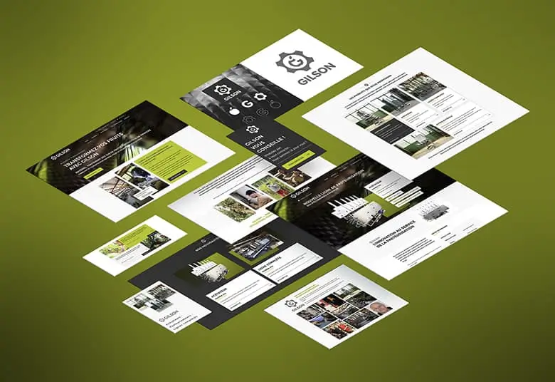
The website has been redesigned completely from scratch in agreement with the marketing manager and project leader. The site plan was discussed and reworked many times and last minute changes were made (without any real impact on the artistic and communication direction of the project).
The colors, typography, iconography and style were decided early on through the presentation of various variations with dummy examples.
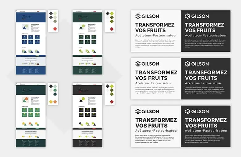
The region (Haute-Savoie) and the machinery construction workshop, were real sources of inspiration. All this greenery and all this metal which reflects it were preponderant in the choice of the colors for example. We insisted on green colors rather than blue (a request from the client) or gray (very industrial and neutral).
The pages were validated one after the other. They were very different in their structure and finally all required a particular care when it came to graphics and information distribution. The "news" page was considered as a kind of landing page and the "our history" page (a prerogative of the client since the beginning of the project) was thought as a kind of bridge with the old site while highlighting the family and historical side of the company.
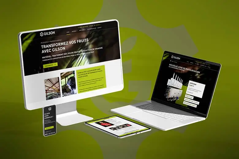
The graphic model integration into a Wordpress theme was done almost identically to what was validated except for some minor changes. The client himself made some changes since the delivery (some parts whose contents are not finalized have been hidden for example).